

North American esports organisation FlyQuest has unveiled a new visual identity ahead of the 2021 LCS Summer Split.

RELATED: Vodafone Giants unveils rebrand, reveals intentions to expand
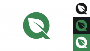
FlyQuest’s new logo looks to heavily lean into its ‘Showcase Greatness’ vision that was implemented in 2020. This saw FlyQuest launch its ‘Go Green’ initiative, which led to environmental campaigns such as TreeQuest, SeaQuest, WorldQuest, and BeeQuest being integrated into the organisation.
This is FlyQuest’s third logo since its formation in 2017. Moreover, all of the organisation’s social media platforms, along with its website, have been updated to match its new visual identity.
Tricia Sugita, FlyQuest’s CEO, told Esports Insider: “FlyQuest’s rebrand marks the end of a long, careful process we began in late 2019. We wanted to share our new visual look with our fans as soon as possible because it better represents what we are and who we want to be. Committing to a rebrand that truly showcases our values can only be a benefit.”
FlyQuest’s new design was created by artist Clara Nguyen, whose clients have included Google, Adobe and The New York Times.
On the organisation’s website, Nguyen explained her reasoning for the design: “The typeface League Spartan is customised with rounded edges to reflect a sense of boldness, adventure, and welcomeness. The leaf drawn within the negative space of the ‘Q’ in Quest paired with an emerald green symbolises the organisation’s many environmental campaigns.”
RELATED: Team Liquid announces fourth extension of SAP partnership
Alongside revealing its new visual update, FlyQuest has announced that in the next few weeks ‘refreshes’ of the organisation’s merch will be launched. Moreover, its new summer split ‘quest’ will be unveiled on Friday.
FlyQuest joins the long list of esports organisations that have revamped their brands over the last 12 months. In 2021 alone, Ninjas in Pyjamas, Vodafone Giants, Rogue, and Dignitas all announced visual updates.
[primis_video widget=”5183″]
Esports Insider says: Whilst there have been many esports organisations rebranding, with varying levels of success and reception from fans, this update certainly matches FlyQuest’s ethos more than its previous design. The new visual look was needed and now there is clear synergy between the organisation’s initiatives and its appearance.
[maxbutton id=”18″ ]